
- LIFESTYLE
- FASHION
- FOOD
- ENTERTAINMENT
- EVENTS
- CULTURE
- VIDEOS
- WEB STORIES
- GALLERIES
- GADGETS
- CAR & BIKE
- SOCIETY
- TRAVEL
- NORTH EAST
- INDULGE CONNECT

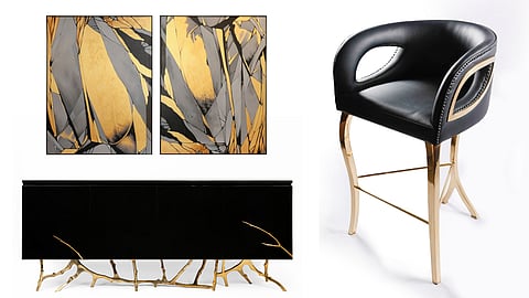
Interior designer Punam Kalra, who is also the creative director of I’m the Centre for Applied Arts, has come up with a new furniture collection titled Fine Lines Products, which plays with the idea of straight lines and planar forms.
The designer tells us that the emotion behind the Fine Lines collection is sophistication that is bold, with a certain depth to it. “The pieces are rather straightforward, with clean geometry that grows experimental here and there, all the while holding on to a quintessential balance. The duotone palette and nimble textures nod to that balance, giving us pieces that can be both a statement and an understatement, depending on the way they are introduced into a space,” says Punam, who is personally drawn to the black-and-gold palette.
Why black and gold became the defining palette of Fine Lines Products
She believes the coming together of pitch black and brilliant gold has more than balance to its story. “With one colour fading into the darkness and the other glowing amid it, it speaks of drama that is toned down a notch, to grow onto us very slowly. The materials, in all their lustre and precision, underline that the colours are certainly more than skin-deep. With a second look, we understand that aesthetics needn’t always be layered when it is this honest, deep and solid. It is exactly the way it meets the eye because it flawlessly pairs colours that would otherwise be torn apart as the foreground and the background,” explains Punam.
So, is there a particular piece from the collection that feels the most “her”? And pat comes the reply: “The duo-disc nesting tables. With clean-cut discs pedestalled by what looks like a pulled profile of those discs, it speaks of simplicity at its best. The black of the discs is left as solid as the colour itself, with nothing but a PU sheen to catch a reflection of the gold stem. From one angle, it might almost feel like an illusion, but from the other, it is a rather simple pair. As a whole, the piece will effortlessly slip into any interior without being barricaded by style,” she shares.
Metal has always been a part of Punam’s moodboard. “Gold or not, the coldness of a metal surface is always desired to balance the warmth of other materials. Here, a warm, gold-toned metal brings it all together, while also demonstrating its hot, molten form in one particular pair. What looks like a frozen chunk of liquid metal actually has a sculptural character to it, in the way it perfectly blends into the ribbed textures of the base without feeling too raw around it. Translating a sense of finesse into that organic form was the challenge I loved the most,” says Punam.
There are subtle details in the collection that people might miss at first glance, especially the textures, which are perfectly underplayed. At first glance, everything feels solid with the overarching black in the palette, but with time, the delicate details are unveiled. “The translucent veining in the marble top, the beaded stitches around the seat of the bar stool, and even the way the gold details are brushed to allow the black to shine and reflect — every detail is revealed slowly with every next glance,” adds Punam.
The collection is not without its design risks. It talks about fine lines in every guise—curved, angular and even crooked— bringing multiple sides to its visual language. “Whilst showcasing different forms takes the collection in a different direction from the meaning of fine lines, everything feels cohesive with the dominance of black. It is a colour that gobbles up everything into its void, and that is probably the risk in playing with it to showcase such vagaries in design,” she ruminates.
Punam, a seasoned interior designer, says that when it comes to interior trends, she believes in timelessness more than trends. “I’d lean more towards quiet luxury because it has that sense of timelessness to it. Everything is quiet without being bland, and characterful without being overwhelming. There’s room for both past and present in such styles. But on the other hand, there are fleeting trends like dopamine décor and FunHaus that say otherwise. While these trends could definitely be compelling with a curated appeal, they are sadly more mishmash. Most of these spaces lack curation, making them a mere collection of interesting, individual items that simply miss fitting into the overall story,” she concludes.
Price on request. Available online.
— manuvipin@newindianexpress.com
@ManuVipin
For more updates, join/follow our
https://www.whatsapp.com/channel/0029Vb677uz60eBXiDYheb0n