- LIFESTYLE
- FASHION
- FOOD
- ENTERTAINMENT
- EVENTS
- CULTURE
- VIDEOS
- WEB STORIES
- GALLERIES
- GADGETS
- CAR & BIKE
- SOCIETY
- TRAVEL
- NORTH EAST
- INDULGE CONNECT

Pantone is a global authority on colour, renowned for its expertise in colour standardisation and trend forecasting. Established in the 1960s, Pantone introduced the Pantone Matching System (PMS), a system that has become essential in industries like printing, fashion, and product design. This system ensures colour accuracy and consistency, making it easier for creators and manufacturers worldwide to align their visions seamlessly.
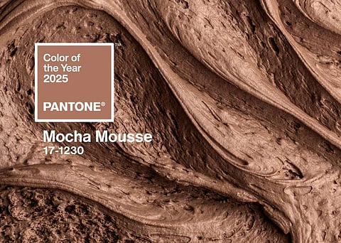
Every year, the Pantone Colour Institute selects a 'Colour of the Year,' reflecting cultural moods, societal shifts, and global trends. For 2025, the chosen hue is PANTONE 17-1230 Mocha Mousse—a rich, warm brown that exudes a sense of comfort and sophistication. Drawing inspiration from natural elements like cacao and coffee, Mocha Mousse captures an essence of luxury blended with the grounding simplicity of the earth. According to Pantone’s Executive Director Leatrice Eiseman, the colour embodies a balance between elegance and approachability, making it deeply relevant in today’s context.
The annual unveiling of the Colour of the Year holds significant influence across various domains, from fashion and interior design to marketing and product development. Pantone doesn’t merely pick a colour—it selects a shade that encapsulates the collective mood of society. By analysing trends across art, technology, politics, and more, Pantone’s choice reflects the emotions and aspirations shaping the world.
Mocha Mousse, for instance, speaks to a collective longing for comfort and connection. Its warm, earthy tones resonate with a desire to create nurturing, inviting spaces, reflecting an ongoing cultural emphasis on well-being and understated elegance. This choice encourages designers and consumers to embrace hues that feel grounding and timeless, offering both a sense of luxury and natural beauty.
Pantone’s Colour of the Year isn’t just a marketing strategy—it’s a visual representation of the moment we’re living in. It influences everything from the clothes we wear to the environments we create, often setting the tone for aesthetic trends in the year ahead. By celebrating a single hue, Pantone offers a lens through which we can explore how colours shape and reflect our lives, turning simple shades into powerful symbols of cultural expression.